Hello World,
We are back again on xRDP topic. This time it’s not about scripting and installation process. This time it’s about the visual aspect of the xRDP login process. If you remember, we have already discusses this topic in the following post : xRDP – Customizing the xRDP login screen to something more appealing. Basically, we were investigating which xRDP login layout would be a better choice than the default currently in use.
In this post, we have played around again with the xrdp.ini configuration file and tried to come up with a possible standard login xRDP screen when installed on the Ubuntu operating system. We had to take into account all the possible constraints and issues that could arise from modifying the default xRDP login screen. We came up with (we think) an acceptable solution.
So, let’s proceed…. !
Previous Design Proposal
Overview
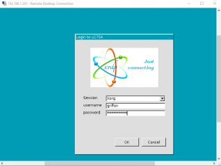
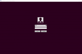
When performing the xRDP installaton whatever the methods you have used (from sources, ready to use packages), there is a big chance that when a user perform the first remote connection to their Ubuntu machine, they will be presented with the following green login page.
Click on picture for better resolution
This login screen is not sexy and not appealing. it always remind us time when we were working with Windows NT 4.0. As you can imagine, this is long time ago… The interface look outdated and we would love to see a new xRDP login screen visual. However, xRDP solution offer a way to customize the login screen and provide a better experience but still not the one we are looking for..
Previous Proposed Design
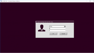
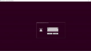
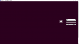
In one of our previous posts (xRDP – Customizing the xRDP login screen to something more appealing), we tried to came up with some new design for the xRDP login screen. Because we are focusing on installing xRDP on top of Ubuntu Operating system, the idea was to match Ubuntu colors and visual aspect….So, we came up with the following possible login screen visual.
Click on Picture for Better Resolution
Click on Picture for Better Resolution
Click on Picture for Better Resolution
Click on Picture for Better Resolution
Based on the feedback received, possible candidate was either option 1 either option 4. Option 4 was the preferred one but as mentioned in the post, to achieve this visual, we had to modify the xrdp.ini file with some settings that would introduce some unwanted behavior when performing the login process… The screen would simply freeze…
New Design Proposal
The New Design Option
Because we are still not happy with the default xRDP login screen, we came up with another design proposal. To build up this design, we have taken into account the following elements
- we want to match the Ubuntu color code (not 100% but at least as a reminder)
- we want to minimize as less as possible the settings within the xrdp.ini file
- we want to have a solution that could work for any situation or configuration
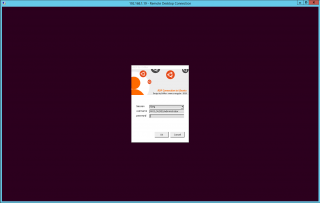
Based on these constraints, we came up with the following design for the xRDP login screen
Click on Picture for Better Resolution
We have been using the Ubuntu purple color for the background. So, no more green background color when performing a remote desktop connection and we have created an new logo banner as well. We have been using some Ubuntu logo (*) to reinforce the fact that we are using xRDP against Ubuntu operating system. The login dialog box background has been set to white to create a stronger contrast with the dark background.
(*) All registered trademarks and trademarks are the property of their respective owners. Ubuntu and Ubuntu Logo are trademarks or registered trademarks of Canonical
This is the cleaner login xRDP design we can come up with. We kind of like it (even if not perfect) because it’s visually good and should be easy to implement as really minor changes have been made in the xrdp.ini file. This login design could be widely accepted by any users or company as we have tried to make it working for the largest number of situation.
If you like this new design, let us know and we will provide the necessary information needed to implement this one. If you know a better way to improve the visual aspect of the login screen for xRDP, share with us… We would love to implement a really great look’n feel for our remote desktop services solution for Linux
Final Notes
This is it for this post ! We are waiting some feedback on the new proposed design for the xRDP login screen. We think that given the trade off that we needed to make, this login screen is far more appealing than the default one. We are testing this login screen through our network and so far we have received some positive comments about it. Don’t forget that nowadays the look ‘n feel is really important to users and they would be more keen in using a software that have a modern interface than something that looks old and out dated.
Please provide some feedback if you think that this visual login screen is better than the default one……
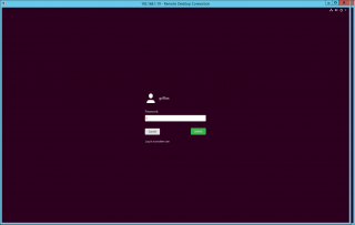
Ideally, we would like to see as xRDP login screen something like the GDM Login page or lightdm, something that’s integrated in the screen and not a login dialog box floating around the screen. When you unlock a session through xRDP, you have a screen like this
Click on Picture for Better Resolution
This is what most of the users/people would expect to see when connecting to a remote desktop session…. We are waiting for your feedback….
Till next time
See ya
If you shared the codes, what you wrote would have meaning. an unnecessary page of text
@Harun,
Thank you for the feedback…Sorry to hear that this is not helping you.. Please do note that the post was asking feedback about the proposed design and it was not the intend to publish code to perform these modifications… The code has been integrated in the xrdp-installer script
Hope this help
Till next time
See ya
Hi, I have made a custom design that I would like to share, maybe it will give you more ideas to build on top.
https://i.imgur.com/tv1ZXec.png
The logic is as so:
1. I dont wana see window title = window height 2500 (covering for 4k screen)
2. I dont wana see window border on the right = sacrifice shadows (black=2c001e;background=2c001e;dark_grey=2c001e;ls_top_window_bg_color=2c001e;ls_bg_color=2c001e)
3. I dont wana see window border on the left = upload logo as a tall rectangle (2500 height) position on the window left border
4. I dont wana see default labels (terrible font) = `ls_label_x_pos=-3000` + lables hardcoded/drawn into the logo
5. OK and Cancel button is optional = Hitting “enter” on password field will perform login so the button could stay “off” the screen.
Limitations:
Logo can not be placed above or below login controls only on the right or left. The reason is that placing the logo over text boxes renders them unclickable as if the were “under” the logo but they remain visible and navigation using TAB allows to complete login.
@stawiu;
Thank you for sharing your ideas, findings and you work.
Looks nice and indeed this can inspire other people. You might want to publish the code behnid your xrdp login customization so people can reproduce it.
Good job
till next time
See ya
@stawiu
Would it be possible for you to post the xrdp.ini settings you made to produce the Login dialog shown in
your picture: https://i.imgur.com/tv1ZXec.png
thanks
Brian
@Brian,
Sorry for the late reply but we are extremely busy lately…..we will try to provide the code for the login screen in the coming days…
Till next time
See ya