Hello World,
Recently, we have been focusing a lot on xRDP and Ubuntu 18.04. Some of our recent posts have been covering how to install xRDP, to fix some issues, tweak configuration and ensure that look’n feel within xRDP Session is quite similar to the one existing when login locally on an Ubuntu machine. In some previous posts (see here and here), we have already described how to change xRDP login screen.
In this post, we have played around again with the xrdp.ini configuration file and tried to come up with a possible standard login xRDP screen when installed on the Ubuntu operating system. Based on the feedback we might receive, this customization might be included in the Std-Install-xrdp script.
So,let’s see what we came up with…
Creating a new Default xRDP Login screen Look’n Feel
Overview
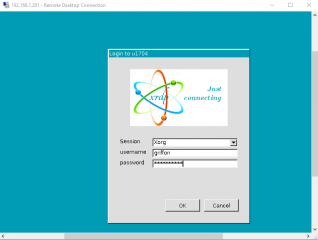
When performing the installation of xRDP (manually, or using the Std install script or custom install script), the default xRDP login screen when initiating the remote desktop connection look like this… This is not really appealing look n feel….
Click on picture for better resolution
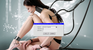
Hopefully, it’s possible to make some customization and improve a little bit the xrdp login experience. For testing purpose, we came up with a layout like the one shown in the screenshot below. We have configured xRDP to use a custom background image.
Click on Picture for Better Resolution
Using a background image implies that screen resolution is standardized through your organization. If you use a picture with size 800×600 but your users have screens 1920×1600, the image will not cover the full screen for those… So, using a background image might not be the best option….
Proposed Layout
Layout Option 1
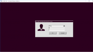
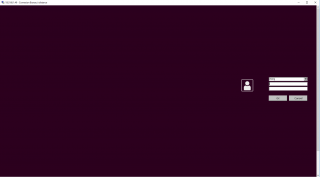
The Std-Install-Xrdp.sh script tries to stick to visual colors used with the latest Ubuntu 18.04 Edition. So, our initial thought was to use the purple background color for the xRDP Login screen. So, after some configuration changes we came up with the following layout….So, we have set the background color to Ubuntu Purple, we have changed the logo and resized the login box… This would be a first option and could become the default xRDP login screen when our script is used….
Click on Picture for Better Resolution
Layout Option 2
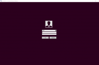
We kept playing around with the configuration file and came up with the following layout. The idea here was to try to integrate the login screen into the background. As you can see, the result is ok but there is still a white border displayed on the screen. This configuration could be another option for xRDP Login screen….
Click on Picture for Better Resolution
Layout Option 3
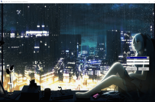
Playing around and around, we came up with the following layout. The login box would be located on the right side of the screen and as you can see there is not more white border.
Click on Picture for Better Resolution
Layout Option 4
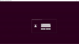
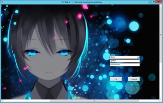
Finally, after a lot of experiment, we came up with this design. We like this design because it’s quite clean and integrated well with the background color….We have also customized the logo to show a new user icon
Click on Picture for Better Resolution
This layout is really cool but come up with some constraints that might be lead us to drop this layout as a standard one to be used in the future….
Button placement
While we were playing around with the customization of xRDP login, we came up with the following consideration as well. First thing is that we cannot customize the button style using only the xrdp.ini file. The button color would stay gray. The other consideration is the placement of these button. On this screenshot, the button are quite near to the last input box. The reason behind this is that the drop down box list has been limited to only two options Xorg and x11vnc..
Click on Picture for Better Resolution
If all the options in the drop-down box needs to be present, then, the button will be placed at a bigger distance of the last input box. This will ensure that if one of the option in the dropdown box is selected, the additional input boxes will be displayed accordingly and will not overwriting the button…
Click on Picture for Better Resolution
Final Notes
Based on our testing, it seems that the best options in order to provide a standardized xRDP login that sticks to the visual layout of Ubuntu would be Option 1 or Option 2. These options simply relies on changing some color settings values and would fit any screen resolution. The size of the login box would need to be adapted a little bit (a little bit bigger) in order to accommodate all the dropdown selection box…
We are really fan of the layout Option 4 but this one has some constraints and inconvenience as well that will make it difficult to deploy it as a standard layout…We like also the usage of background image and placing the login box at the right side but again this would not be an option for the moment….So, let’s us know which layout your prefer and we might integrate this configuration as an option in our famous Std-Install-Xrdp.sh script that would blow away your xRDP users (at least we hope : -) )
Till next time
See ya
Personally i like Layout 4 however will give feed back on your layouts.
Layout 1: Ideal Default login screen, simplistic without the possibility of conflict between different OS’s
Layout 2: Although similar to Layout 1 it conflicts with the theme and makes it look messy (Yep that Box really makes it look bad)
Layout 3: I can see screen alignment issues cropping up with that.
Layout 4: The perfect dream login screen its not too far out of what Ubuntu or many Debian Distro’s normal login screen. Looks cleaner as well.
@William,
Indeed, for simplicity reasons, i think the best option is probably option 1 because it would be a standard configuration that could fit any screen resolutioins
Thanks for the feedback and for visiting our blog
Till next time
See ya