Hello World,
The next Long term service (LTS) release of Ubuntu better known as Ubuntu 20.04 will be release in a few weeks. Ubuntu 20.04 is still under development but recent daily build ISO image can already provide a good overview of what to expect with this new release. This release will be probably the most robust and the most polished version of Ubuntu. Expectations are quite high on this release.
Ubuntu 20.04 is not changing drastically. We will have the same way of working, the same desktop interface… However, this version seems to be the most polished and finalized version of Ubuntu. Small improvements in the desktop interface, uniform and coherent color scheme, recent gnome performance improvements make this expected release to be the most worked out version of Ubuntu.
Ubuntu 20.04 should be seen as a modern desktop solution that can run nicely on modern hardware. During the last years, it seems that Canonical has really created a visual brand for Ubuntu through the color scheme, the YARU theme and the general visual aspect. All this work has paid off as Ubuntu operating system can be recognized and identified immediately from the login screen or lock screen.
So, let’s have a quick look at what to expect on Ubuntu 20.04.…
Overview
Installation Process
In this section, we will quickly describe how to perform a basic installation of Ubuntu 20.04 and check if there is any major changes in the installation process. We have performed the installation on a virtual machine hosted on Hyper-v. All in all the installation process is similar to previous editions. There is a minor change in the disk partition page where more options are available (related to the zfs experimental filesystem). So, to perform the Ubuntu 20.04 installation, you download the ISO image, mount it to your virtual machine, boot your machine and you should see the installation wizard starting in front of your eyes…
Note : We have been using a daily build image… Do not use in production as daily build images are to be considered test or preview version of the final product…..
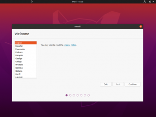
The installation wizard will present you the Welcome page.
Click on Picture for Better Resolution
You can already seen minor visual changes. The solid black top bar is there, the wallpaper for Focal edition is included and the aubergine color scheme is being used in the wizard page (the dot section). The English selection is still set to Orange color…This might change to aubergine color in the final release which will provide maybe a more consistent color scheme and visual aspect.
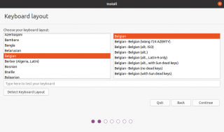
In the Keyboard selection page, choose your keyboard layout and press next. Again, here the orange and aubergine color have been used. Press next
Click on Picture for Better Resolution
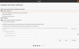
In the Update pages, select your options. Minor changes have been introduced here as well. Again, the checkbox and selection option are using the Aubergine color (in Ubuntu 19.10, the color was green if I remember correctly) which again provide a more consistent experience. Press Next
Click on Picture for Better Resolution
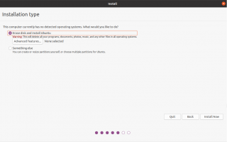
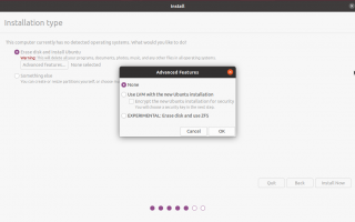
In the installation type page, we can see again a minor change.
Click on Picture for Better Resolution
To simplify the installation, the default choice would be now to erase the disk and install Ubuntu on top of it. However, if you need more advanced features, you can either click on the additional button or click on the other option. Color schemes are consistent here
If you click on advanced Features, you can see an additional dialog box showing you LVM and ZFS options
Click on Picture for Better Resolution
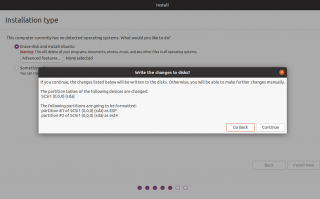
After you have made your selection, you will be requested to validate your choice and will be able to proceed through the Wizard
Click on Picture for Better Resolution
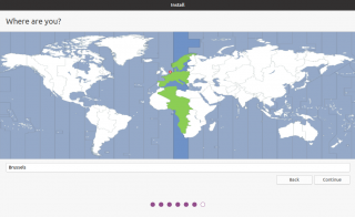
Choose your Time zone and Press Next
Click on Picture for Better Resolution
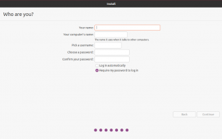
In the who are you page, create the initial account that would be used to perform the login. Here again no much changes, only the aubergine color scheme is the noticeable modification. Press Continue
Click on Picture for Better Resolution
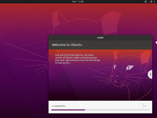
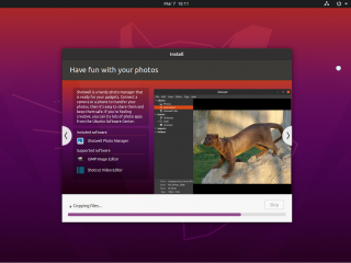
The Installation will start. Again, minor visual changes have been introduced in the slide show running while the installation is ongoing. Progress bar is using the consistent Aubergine color scheme and the slide show seems to be updated as well… New images used….
Click on Picture for Better Resolution
Click on Picture for Better Resolution
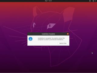
At the end of the installation, you will be asked to reboot the computer. Press OK and wait for your newly Ubuntu machine to start and to present you the new login page…
Click on Picture for Better Resolution
Visual Changes at login screen
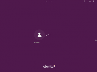
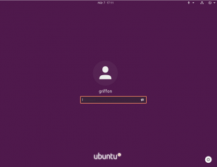
When the computer reboots, you will be presented with the new login screen. The background color seems lightly different that the previous version and the user icon has been also slighty modified and included in a lighter purple circle.
Click on Picture for Better Resolution
Select the user in the list to be used to login. You will be able to enter your password in order to login
Click on Picture for Better Resolution
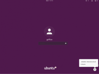
Here again, there is a small change. There is no login button available and the gear icon is not under the password dialog box but at to right bottom corner of the screen…. This minor change is actually quite pleasant. There are no more unpleasant button colors visible on the screen….
If you click on the Gear (and based on your hardware I would guess), you can see normally three options to login
- Ubuntu
- Ubuntu on Wayland
- Gnome + Remmina Kiosk
Click on Picture for Better Resolution
Other Visual Changes
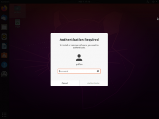
After you have performed your login, you will see the new Focal Wallpaper presented to you. As updates were needed, we have noticed also that the permission dialog box has been modified slightly and seems to provide a different visual. Color scheme wise, Gnome is still using the white background to have a stronger contrast with the desktop look n feel that’s more dark….
Click on Picture for Better Resolution
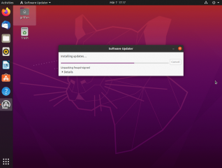
The Update dialog box is also using the new aubergine color scheme. This minor changes really provide the feeling that the visual aspect has been standardized and provide a feeling of finalized product.
Click on Picture for Better Resolution
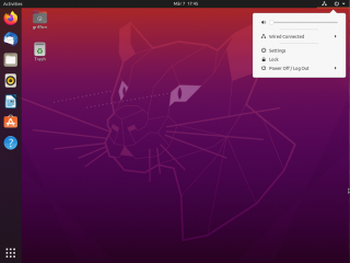
Another minor change but which will speed up logoff/reboot operations is the modification of the Power dialog box option. From the dialog box, you can now get immediate access to the lock screen button.
Click on Picture for Better Resolution
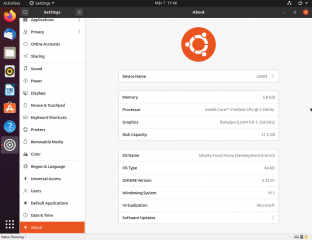
If you click on the Settings icon and go to the about page, you can see that more information are available in this page. The page is showing if the machine is physical or virtual and which hypervisor is running. Again, probably a small improvement but this can help in identifying Ubuntu version and dependent software used
Click on Picture for Better Resolution
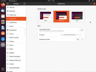
The other change that has been introduced and that has been relayed extensively on internet is the possibility to change theme from the Settings page and there is no need to install the gnome tweak tool…. Indeed, in the screenshot below, you can see that now, it possible from the appearance page to select between three “windows color”
- light
- standard
- dark
Click on Picture for Better Resolution
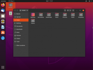
To test it, we have selected the dark mode and you can see that the look n feel has been changed accordingly. In Nautilus, we can also notice that there is a new set of icons used. Again, this is probably a minor change but changes completely the visual aspect of the desktop.
Click on Picture for Better Resolution
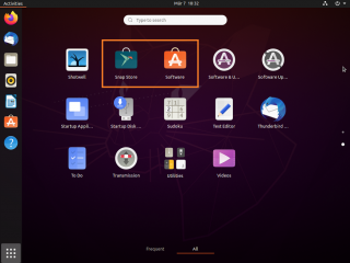
The other change that has been introduced as well is the repackaging of the software center using the snap format. Looking at all applications, we can see that we have indeed two software center available. One is the traditional one (and currently default one in use) and the newly snap version of the Software center. Maybe in the final version of the product, the snap version will be used and will be the default one….
Click on Picture for Better Resolution
Final Notes
That’s is for this post ! All in all, Ubuntu 20.04 seems to be a really pleasant release. Using the daily build image, the release was quite rock solid. We experience in general good performance. Ubuntu 20.04 release has been visually polished and offer a more consistent and pleasant look’n feel. This release seems really promising. The way of working and installation process has been kept similar to the previous version but all the small adjustment introduced in the release make it really appealing.
Canonical and Ubuntu team seems to have invested in the branding of Ubuntu and it seems that’s paying off as well. As mentioned earlier, it’s more and more evident to identify a computer running Ubuntu software through the visual identity that has been created and polished through the different iteration of Ubuntu since the switch from Unity Desktop..
Hope you enjoyed this post
Till next time
See ya

